Welcome! Check out our latest blog and exciting news.
Read more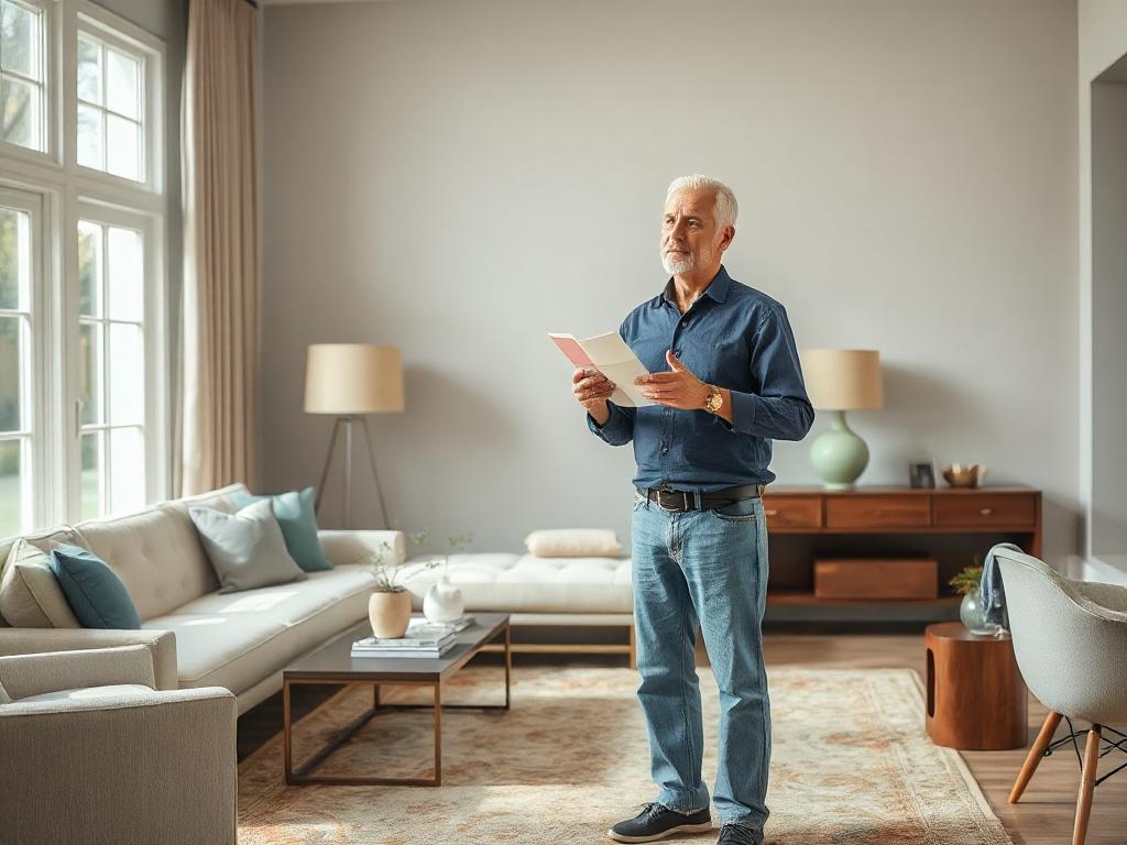
Most people assume color consulting begins with a stack of paint chips and a conversation about what's trending. In reality, the most important questions a color consultant asks have nothing to do with color at all. They're about how you live, how light moves through your home, and what you actually need a room to do for you. The paint comes later. The practical decisions come first.
A color that photographs beautifully in a design magazine can feel completely wrong in your home, and it's rarely because the color itself is bad. It's because the room it was photographed in isn't your room. The light is different, the furniture is different, and the way people move through the space is different. Color consulting that skips those details is really just decoration advice dressed up as something more.
Good color work starts with function. A room that's used for focused work needs to feel different from one used for winding down at the end of the day. A dining room that hosts loud family dinners calls for something different than a quiet reading nook. These aren't aesthetic preferences; they're practical constraints that shape every subsequent color decision.
Natural light changes throughout the day, and it changes differently depending on which direction your windows face. A north-facing room gets cool, indirect light all day long, which means warm whites can look gray and saturated colors can feel flat. A west-facing room is flooded with warm, golden light in the afternoon, making some colors glow while others look washed out.
Before a single sample goes on the wall, a color consultant needs to understand how light behaves in a specific room at different times of day. That means visiting the space, or at a minimum, asking detailed questions about window placement, ceiling height, and how much of the day the room is actually used. Skipping this step is one of the most common reasons a color that looked great on a chip ends up feeling wrong once it's on every wall.
Room function is one of the first things a color consultant needs to understand, and it goes beyond simply labeling a space as a bedroom or a kitchen. The habits, schedules, and people connected to a room all influence what a color needs to do there. Two living rooms in two different homes might need completely different color palettes simply because the families who use them live differently.
Open floor plans and multi-use spaces present a real challenge for color. A kitchen that flows into a living area can't be painted as two separate rooms, but it also can't ignore the fact that those two areas serve completely different purposes. The goal is a color story that reads as cohesive while still giving each zone its own sense of purpose.
The way people actually use a space matters just as much as how it's laid out. If a home office doubles as a guest room, the color needs to support focus during the week while still feeling relaxed and welcoming on weekends. That's a specific brief, and it's the kind of brief that only comes out of a real conversation about habits and routines.
Paint is one of the easier things to change in a room. Flooring, cabinetry, tile, and large upholstered pieces are not. A color consultant works with what's already there, which means understanding the undertones in your hardwood floors, the warmth of your kitchen cabinets, and how your sofa reads under different lighting conditions.
These fixed elements aren't limitations; they're actually a helpful starting point. They significantly narrow the field of viable options, making the decision-making process faster and more confident. A room with warm-toned wood floors and cool gray tile has already told you something important about where the color palette needs to land.
A thorough color consultation touches on more than just wall color. Here's what that process typically includes:
By the time paint samples actually hit the wall, the list of options has already been narrowed by these practical filters. That's what makes the final decision feel clear instead of overwhelming.
Color theory has its place. Understanding undertones, complementary relationships, and value contrast is genuinely useful once the practical groundwork has been laid. But leading with the color wheel before understanding the room is like choosing a piece of furniture before measuring the space. The theory only works in context.
The colors that end up feeling right in a finished room are almost always the ones chosen with a clear understanding of what the room needs to accomplish. That clarity doesn't come from a color wheel. It comes from asking the right questions about how real people use a real space.
At Mark Sweetman Painting, our team approaches every project with the practical questions first. We take the time to understand your space, your light, and how you actually use each room before we ever talk about specific colors. That process leads to results that look intentional because they are.
If you're ready to take the guesswork out of your next painting project, schedule a consultation with our team today. We'd love to help you get it right.
Stay updated on the latest colors and painting news!
Thank you for signing up!
Something went wrong. Please try again later.